How to interact with the whole fossil record
The Paleobiology Database (PBDB) is a public, digital archive of the fossil record. Based on countless hours of work from more than 400 scientists around the world, it now contains more than 1.3 million individual fossil occurrences from around the world in a single database that is accessible by everyone. That’s pretty awesome.
What’s even more amazing is what people can do with that. Personally, I’ve used the PBDB as the basis for several publications, and have contributed much data to it myself during my PhD.
Now witness the power of this fully armed and operational fossil record
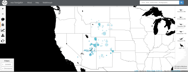
Jostein Starrfelt published an intriguing paper last year that unveiled a new method to analyse the fossil record to estimate how biodiversity changes through time. Now, he’s leveraged the power of the PBDB to create an interactive tool that allows anyone to visualise how biodiversity changes over millions of years for any fossil group!
For example, you might want to look at dinosaurs again, because dinosaurs. Here’s how you do it:
- Enter ‘Dinosauria’, the official group name for dinosaurs, in the ‘cladename’ box
- Select something like 100,000 occurrences – this is far more than actual dinosaur fossils, but makes sure that the program pulls in all without excluding any by mistake.
- Click ‘Get data and analyse’
- Wait a few seconds, and the results pop up!
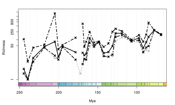
What do these wiggly lines all mean?
How neat is that? What you get are two graphs as outputs. These show you several things that are kinda cool.
- The grey line shows you the raw diversity estimates calculated by simply adding up the number of different dinosaur species in different time intervals (e.g., geological stages)
- The thick black line is the ‘corrected’ diversity estimate based on Starrfelt’s method, called TRiPS. This accounts for differences in the sampling of the fossil record through time.
- The dashed lines are the upper and lower confidence intervals for the TRiPS diversity estimates. Doing this is just good stats, and accounts for uncertainties in our calculations.
What this tells us, then is how dinosaur biodiversity has changed over millions of years. This is something I’ve published on before too, and have another paper being currently peer reviewed on, so is of great research interest! As we can see, it has not always been constant. It goes up in some periods, as more dinosaur species are around, and down in other periods as some dinosaur species go extinct.
You too can do a science
Now it’s your turn! You can, and should, play with it on your own – try comparing the three main dinosaur groups, Sauropodomorpha, Ornithischia, and Theropoda. Do they all match this larger dinosaur-wide pattern, or have their own evolutionary trajectories? You can work it out for yourself in seconds!
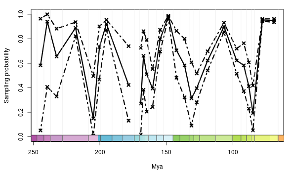
The second chart shows how the sampling probability for dinosaurs changes through time. This calculation accounts for variation in the number of times each species is observed in the fossil record. That’s where things get a bit technical, but is a point of major debate among palaeontologists at the present. Other neat things you can see include the full table of results, an ‘occurrence matrix’ (very handy for advanced analyses), as well as who entered the data (you’ll even be able to see me if you do anything with Jurassic or Cretaceous animals!). In short, this is awesome. Really awesome. And a huge ‘open science’ step for Palaeontology. I also totally wanted to build this, and am glad to be able to spend the time doing other things now.
One of the cool things is, because Starrfelt has only published his method on dinosaurs (for now), almost every time you analyse data for any other group, that will be the first time that research has ever been made, and the resulting patterns displayed. Go forth and science!